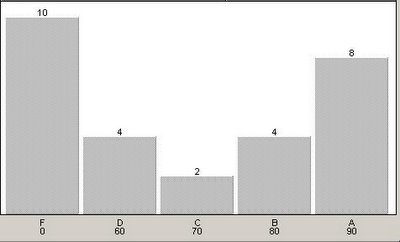
For some reason, the grade distribution in my classes tends to look like an upside-down bell graph. Here's an example:

I don't know why this is. Of course, most of the Fs are from students who won't do anything. And then, I suppose, since I make it hard not to get a good grade in my class, the chart becomes top heavy.
What I do know is that this distribution says something about my teaching and that something is not good. I just don't know what that something is.
.png)
Ah, I see the problem.
ReplyDeleteJust turn the graph upside down. That should skew the scale to fit the normal distribution.
There ya go...
You are clever and funny. Thank you for existing.
ReplyDelete.
ReplyDeleteDo you mean me or Studpi?
It's like on "A Wonderful Life" when Jimmy Stewart sees everything backwards.
ReplyDeleteOr maybe that was Naked Lunch. I get the two confused.
The only concern I would have is that 35.714285714285714285714285714286% is failing. Now, when I was an instructor in BYU's Composition program, I took great pride in my class average. But this can't be good. Even if there were concerns of departmental grade inflation.
ReplyDelete1) Get rid of homework.
ReplyDelete2) Make impossibly difficult multiple-choice tests.
3) Curve the average to a C.
Eh, eh? Doubt they're so lazy as to refuse to bubble every response C.
Yeah, I like your way more.
.
ReplyDeleteWhat's my way?